With the digital era upon us, we are constantly bombarded with media, through television, Facebook, Instagram, Netflix, product placement, phone apps… the list goes on and on. And with this deluge of information, our attention spans are getting shorter and we have less tolerance for the mundane. That is why, now more than ever, it is so important to have a logo that is eye-catching, memorable and on point. It needs to stand out amongst the constant chatter of our lives as well as give some insight into who you are as a company. Now could be the perfect time to look into sprucing up your logo or even getting a whole new look. Here we look at what we believe will be the top 5 logo trends that will dominate 2018 and get your business noticed.
1. Bright & Fun
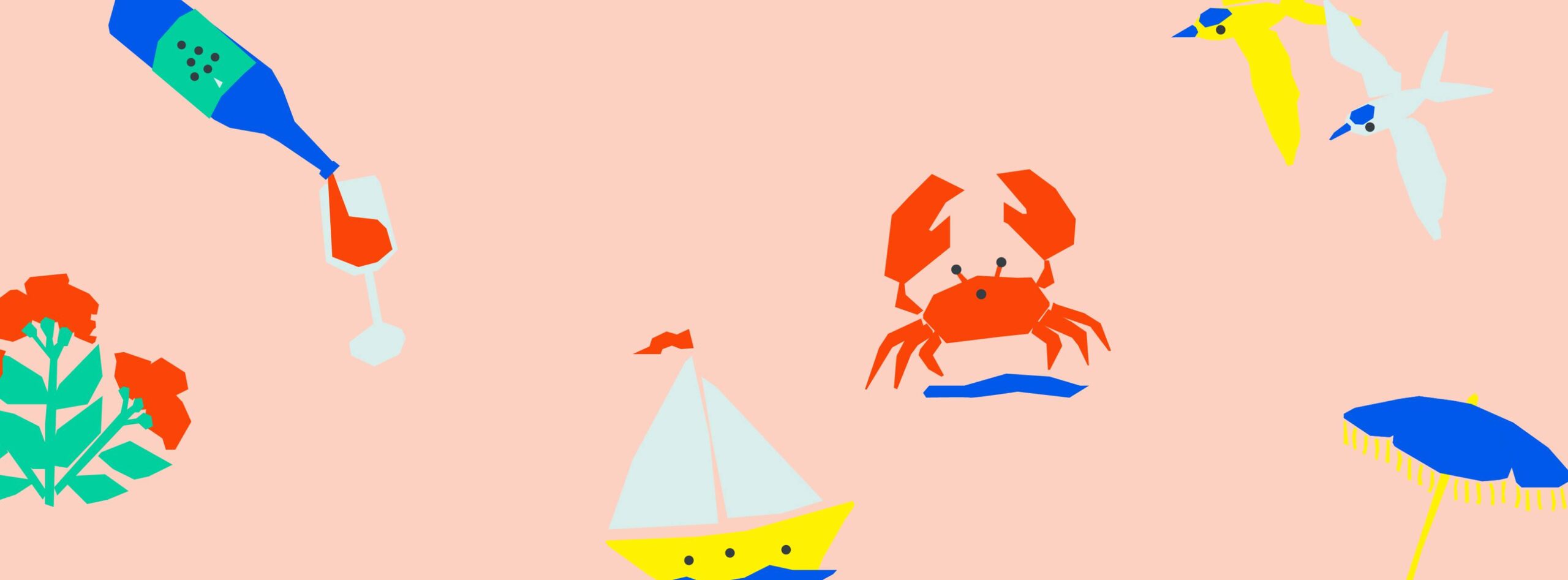
2018 is all about bright colours and logos that make us smile. Whether the trend has come about as a counter to the growing negativity in the world, or just because fun sells, we are seeing cute characters, bright colours and good vibes popping up all over the place.
Luxe Waiheke is a luxury events-based business in New Zealand. This design by A Friend of Mine features joyful typographic features (note the ‘e’ that looks like a laughing emoji) paired with popping colour and fun icons. It is playful in nature without losing any class.
2. Creative Typography
With most logos containing text based features, designers are having to step outside of the box to come up new and exciting looks for their clients. Experimentation with typefaces isn’t necessarily new, but we are seeing an emerging trend of split typography, chaotic letter placement and hand-written effects.
This summer promotional logo designed for Native Apparel takes a basic sans serif font and transforms it into a vibrant logo with movement and life.
3. Geometric Shapes
The idiom ‘less is more’ is taking on a whole new meaning when applied to logo design. Instead of intricate designs and over-complicated patterns, simple geometric shapes are coming to forefront of logo design. Creating branding versatility, easy readability and instant impact, it is not hard to see why so many companies are turning to simple geometry to get their brand noticed.
This logo for Circle & Square, created by Angstrom Alliance incorporates the three elements in the company name in a simple, cohesive design, with more than a hint of minimalism. The three stripes used to depict the letter ‘e’ also play on this geometric trend.
4. Logos Designed for Social Media
Social media is inescapable when it comes to marketing your business. Often, this will be the first place potential customers encounter you and your brand. So, it should come as no surprise that social media-friendly logos are on trend for 2018. But what does this mean for you and your logo? Most social media platforms have a square or circular space where your profile picture – or logo for a business – is displayed. If you have either a long horizontal or vertical logo, it will either be cropped or shrunk to fit, leaving it illegible. This doesn’t necessarily mean that you need to redesign your logo to be a square. Instead, choose a logo with good visual balance across both the vertical and horizontal axis, or ensure that you have multiple options in how your logo is portrayed (a stacked version as well as a horizontal one). You will also need to keep in mind that the logo needs to be recognisable at small sizes. Intricate designs will get lost when shrunk down and excess wording will become unreadable, so keep it simple.
Wholefoods Market have their iconic logo in multiple different formats so that it can be used across a wide range of media without losing integrity. The circular version is perfect for using on social media, while the horizontal iteration is used for signage and storefronts.
5. Letter Stacking
Letter stacking is a trend that is emerging as a way for brands with longer names to create concise and unique logos, that are versatile. It is also a way of spicing up an otherwise simple wordmark.
The logo for Sainte Agethe Des Monts, a town in Quebec, is a great example of a long name that has been stacked to create a fun and inviting logo. The off-centre stacking gives the logo movement and a playful feel, perfect for a vacation town.
While we all want to be on point and at the forefront of design, it is important to remember that there is far more to logo design than following a list of ‘what’s hot’. You also need a logo that is going to be timeless – changing your look every year won’t do you any good with your consumers. So here is a short list of factors that will help to ensure you have a trendy, yet enduring logo:
- Keep it simple
- Avoid clichés
- Design for your brand, ensuring it encapsulates what you stand for, not just for what is on trend.
At Creative Curiosity, our portfolio includes logo design and general graphic design services, so if you’re in need of a logo, branding assets or any other graphic design, get in touch with us today.


