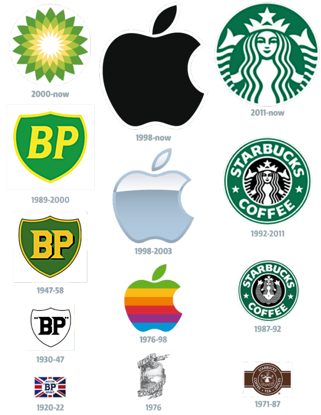
Some of the best logo’s in the world are made of ticks and fruit. But perhaps the most important aspect to a good logo and branding strategy is your design language and presentation. A logo should use ‘design principles’ to explain a company or products, and usually, the simpler the logo design, the more effective its message.
If you look at some of the most iconic brands of the 21st century, you’ll see that over time – their logo’s slowly become more simplified, flatter, and less embellished. This may say something about the nature of global design progression – however it does say something about how customers expect, and relate to a logo and brand that get refined over its age.
Take for example BP’s logo. For over 50 years the company’s image was letters and badging, appealing to the larger masculine market, and has an industrial, heavy duty feel derived from its sharp edges, badge presentation, and strong, dynamic lettering. The re-brand of this logo came with impeccable timing, as the external factors to its market change, and BP had to change as well. Making the move to a geometric pattern blossoming flower, communicating organic growth and visions of life – the brand placed itself at the forefront of sustainable thinking and fuel technology.
To properly appreciate how a brand can change over time, and what makes a logo design work effectively, is to measure how a brand reacts to market change, and whether the brand responds to shifts in the markets overall design movement.
